I think the combination of the main product and ancillary text has worked really well. They all emphasise each other and it is clear they have a relationship showing their immediate link. Without the film trailer neither the poster or the magazine would make sense, the pictures would have no meaning and the text would be irrelevant. However the poster and magazine are so important as they build the tension for the film. They are almost a blurb for the film enticing people to want to watch the trailer. Without the combination of the products the overall production would not be as effective. We linked the products by using a similar colour code, for example the text in the trailer is white on a black background we did this to create a sinister atmosphere. We then on the magazine front cover and film poster included a lot of blacks and whites to link the two. In the magazine front cover and film poster we have made a link by using the colour red as one of our main colours. Also the font of the film title has stayed the same on each product showing a distinctive link. If we were to do the products again and we were changing the fonts my only change would be is that maybe the font we used in the film trailer for the actors names stayed the same on the film poster because this should run throughout.
On each product it is clear that Ellie is our main character again this is a very clear indication that the three products are linked. In each image of Ellie we put her in the same clothing and did the same style hair and make-up, we did this because if she was dressed completely differently it would most likely confuse the audience and therefore the link between the products would be weak.
Another image we kept the same throughout was the image of the house. We obviously made sure we used the same house otherwise the image would be irrelevant.
All in all I believe that we have successfully linked the products. It is a very important factor of our production as it will help successfully market them.
Tuesday, 22 March 2011
In what ways does your media product use, develop or challenge forms and conventions of real media products?
The whole media project has been based around real media products meaning it was our responsibility to challenge and develop real media conventions. I began by doing in depth research into other media to get guidelines of how to begin our media products in a professional way. We began looking at the conventions of all the different genres for example - a rom com- would generally be very high key (lighting) and have a funny story line usually where a young couple falls in love, or a horror- usually has a main victim and a murder and is genrally set in a woods or old house. We then found an real interest in the genre Thriller, and decided this would be the genre we chose. The conventions of a thriller are: (Below each convention I have tried to show how we used each convention in our production.)
Overall I think we managed to develop and challenge media conventions successfully. Although there are some areas we could of taken the research and ideas further I think what we did do has made our media products look more realistic to the target audience.
- sound and editing- Low pitch music and beats. Quick cuts, low camera angles, night vision, fade in and out and flashes. All of these help build and create the tension within the trailer which is vital part of a thriller film.
- The conventional music for a thriller trailer is generally music that gives tension and adds a hint of fear making the viewer scared, but generally it begins with a steady slow beat song to introduce the story line it then picks up pace to create anticipation for the main event.

- lighting, especially the use of shadow and darkness, this might be used if there was something that needed to be kept a secret to create more suspense.
- props can also be effective such as the use of mirrors or weapons, although not really a prop, stairs can also be really effective as they create a chase that is nerve-racking
- Setting- This is a very wide category as a thriller can take place pretty much anywhere but the most common settings are woods, houses and holiday homes.


Throughout the project we as a group paid attention to the fact that that we needed to follow the conventions of our genre. We followed the conventional story line using Longacre's theory by beginnining with a 'once upon a time opening' then a 'climax' but also adapted it, as are production is only a trailer we didnt finish with the conventional 'conclusion' as that would defeat the object of it being a trailer. We decided to follow this narrative as we felt it conformed to other real media products. It is a very common theory used in our genre trailer. For example 'The shining' begins with a family going to stay in a hotel. The beginning of the trailer is very calm and happy this creates an atmosphere to the viewers making the almost unaware of the happenings that are about to take place. This also helps build up the tension and suspence and this is exactly what we wanted to do in our trailer. The trailer then takes a turn and the husband becomes violent, there are alot of chase scenes which is really nerve-racking to watch and we have also used an idea like this in our trailer. The trailer then ends on a cliff-hanger almost a "what happens next" and again our trailer does this so that is doesnt reveal what the story line is.
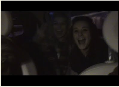
We used similair settings to other films we had looked at for example- Paranormal activity- is set in a normal house, for our trailer we used one of our homes to make it as normal as possible. Another main theme in paranormal activity is the found footage throughout, we also used the idea of a found footage but decided to only use that for a section of our trailer not all of it. Our idea behind this was that it gave it a realistic feel. The fact that the girls were filming themselves would make the viewers feel more involved in the 'excitment' of the girls holiday.
The images below show paranormal activity found footage (op) and our found footage (below) 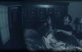
Another way we used and developed the standard conventions of a real media product was attracting are viewers in the same way. In any film these days if an actor in it is highly famous and good-looking it immediatly attracts more viewers. For example the film Jennifer's Body 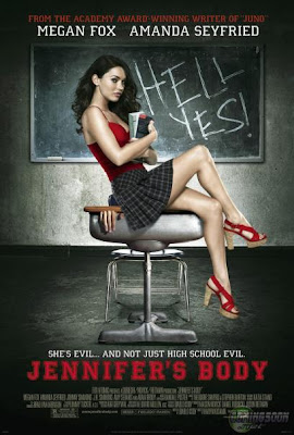
This film made a huge $2.8 million on its first day and most of this money was proberbly drawn in because Megan Fox was playing the main part. We needed to attract are viewers with an attractive girl that could be a 'star' we chose Ellie as she has the typical look of an actress. It was important that ellie was our main picture on the magazine front cover and film poster as these were are main advertisement for the trailer and film. We also devloped this idea, by editing the images of Ellie before they were placed on the magazine front cover and poster. We did this to make them more dramtic and eye catching to the audience. On the magazine front cover we decided to make the image of Ellie red, although this is not a common convention this is an idea has been seen before in films such as 'Red Riding Hood', 'Red white and blue' and 'Dead end'.
Another important aspect of making a realistic trailer and other products was that we followed the conventions of how much information they should hold and how much they should tell the reader. We looked at lots of trailers to see what sort of information they hold about the film. We found that generally it was the Logo- for the production label, the Title, the Release date and maybe a web address. We used all of these in our trailer but also developed them by adding in snippets of writing and the tagline.
For our film poster we followed the conventions of a Teaser poster which almost has set guidelines for what information it holds. We followed these guidelines but also added and took away text where we felt appropriate. To make our poster look as realistic as possible we again did more research into what the conventional film poster looked like. This helped follow but also develop these original ideas. For the magazine front cover we wanted to make it look busy and exciting. We realised that a magazine was much more interesting and appealing when it looked busy but we had to make sure it didn't look to cluttered as it could become confusing. We followed the conventional layout, with this title at the top we also stuck to a colour scheme so that the magazine didn't look tacky.Overall I think we managed to develop and challenge media conventions successfully. Although there are some areas we could of taken the research and ideas further I think what we did do has made our media products look more realistic to the target audience.
Monday, 21 March 2011

Thursday, 3 February 2011
Font Changes
As we had decided on fonts on a Non- School computer some of the fonts we picked were unavailable for us to use. Also when using some of the fonts we had picked we decided they just didnt look right or fit in with the theme.
These are the new fonts we will be using, some have remained the same but some have changed.
These are the new fonts we will be using, some have remained the same but some have changed.
- Playback- Magazine front cover name will be in font - Franchise.
- Darkness Awakens- Title of the film on the magazine front cover, film poster and movie trailer will be in font- ACID LABEL of Dafont.
- Film awards 2010 highlights- writing on magazine front cover will be in font- impact
- Exclusive interview- writing on magazine front cover will be in font- Copper STD
- Issue 217-writing on magazine front cover will be in font-200 Century gothic
- Trailer writing (Eleanor Failes/ release date)- will be in font Tosca Zero
- Behind the scenes- magazine front cover- impact
Editing images for the film poster
The editing of the magazine front cover was Ellas job. Image for the Film Poster: We chose this image due to the lighting and the composition of the image. We also felt her facial expression was good. The ratio of her face and hair was effective as her hair was slightly covering her eye giving it a mysterious look. We dressed her in the same clothes as in the trailer to make the connection. Her bright blonde hair gives her a celebrity look making her attractive to onlookers. To edit this picture we used paint, painshop pro, fireworks and in design. Ella first had to remove the background so we had purely just an image of Ellie.
  We were editing our pictures in paint and Fireworks we used a combination of the Magic Wand Tool and a simple eraser tool. After editing out the background. We played around with the saturation/ hue and contrast to just see what sort of effects we could produce. After discussion and looking at different posters we decided that this image could look quite effective in red. This is the poster that we got the idea from: The red in this poster gives it a real sinister look and I feel this is very effective. The first connection people will make with this colour is blood but also danger. As this image of ellie will be placed in front of the house. The red will make the connection with the house and symbolise that the house could be dangerous.As we were also trying to make our poster as realistic as possible we had to follow the same conventions as an actual film poster. Doing some research we realised having a red picture was quite common in thriller/horror films so we felt it would be appropriate.

As seen conventionally on most film posters Ella added credits at the bottom and our production label:
 After this our film poster had finally come together.
This was our final film poster:

 We chose this image due to the lighting and the composition of the image. We also felt her facial expression was good. The ratio of her face and hair was effective as her hair was slightly covering her eye giving it a mysterious look. We dressed her in the same clothes as in the trailer to make the connection. Her bright blonde hair gives her a celebrity look making her attractive to onlookers. To edit this picture we used paint, painshop pro, fireworks and in design. Ella first had to remove the background so we had purely just an image of Ellie. We were editing our pictures in paint and Fireworks we used a combination of the Magic Wand Tool and a simple eraser tool. After editing out the background. We played around with the saturation/ hue and contrast to just see what sort of effects we could produce. After discussion and looking at different posters we decided that this image could look quite effective in red. This is the poster that we got the idea from: The red in this poster gives it a real sinister look and I feel this is very effective. The first connection people will make with this colour is blood but also danger. As this image of ellie will be placed in front of the house. The red will make the connection with the house and symbolise that the house could be dangerous.As we were also trying to make our poster as realistic as possible we had to follow the same conventions as an actual film poster. Doing some research we realised having a red picture was quite common in thriller/horror films so we felt it would be appropriate.
 Ella went on to change the image into red to see the effect. On fireworks she added an inner glow to the original cut out image and then changed the colour to red. She then made the contrast high and lowered the brightness. We did a few different shades of red to see the difference and decide which one we would like.
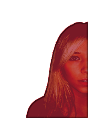

We decided to use the darker red as it represents blood red which fits in well with our genre.
The next stage of the magazine front cover was to edit the background image, I did this by changing the contrast and brightness to make the house look more dramatic. This is the image we are going to use. 
After this the next job for ella was to layer the image of Ellie on top of the image of the house to create the final whole image that would be used for our magazine front cover. Ella did this by copy and pasting the picture on top of the house and making it a separate layer. She then moved the image around until she felt it looked right. This is the final image.
 The next stage was adding the text. We had decided as a group to use the same throughout for the title this was called Acid Label. We had originally decided the font would be black but Ella realised that it wouldn't work as we were having a black background so instead we made the text white.
  We felt this worked well as it stood out. Ella also layered this text over Ellie's face to link it all together.

As seen conventionally on most film posters Ella added credits at the bottom and our production label:
 After this our film poster had finally come together.
This was our final film poster:

Tuesday, 1 February 2011
Images for our film poster
I was in charge of taking the photos and then me and ella edited them so that they could be placed straight onto the poster that is being done by Ella and the magazine done by Charlotte.
Editing:
The first process of editing our images was picking the images we were going to use.
The editing process was Ellas designated job but we all took turns in using the software as it was important that we all became familiar with it.
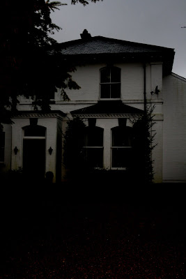
For the film poster we picked this photo:
We picked this image because it included all the aspects we wanted. We wanted a picture of the house from a front on view, it always makes it dramatic when the house it partly covered as if it is hiding away and the tree is covering a bit of the house which gives it that effect. The composition of the picture is perfect as in on the poster front cover we needed block colours so that we would be able to successfully place writing over the top. The gravel in the drive way will allow us to do this as this is about 35% of the picture.


Editing:
The first process of editing our images was picking the images we were going to use.
The editing process was Ellas designated job but we all took turns in using the software as it was important that we all became familiar with it.
For the film poster we picked this photo:
We picked this image because it included all the aspects we wanted. We wanted a picture of the house from a front on view, it always makes it dramatic when the house it partly covered as if it is hiding away and the tree is covering a bit of the house which gives it that effect. The composition of the picture is perfect as in on the poster front cover we needed block colours so that we would be able to successfully place writing over the top. The gravel in the drive way will allow us to do this as this is about 35% of the picture.


Monday, 31 January 2011
Film Poster Planning
Ella did a rough template of what our poster may look like as we didnt have any of the actual pictures to put on it so we wanted to do a plan.


Ella did this on Adobe design and we used the original ideas on the original drawn poster.
This is Ellas template


Although this is jsut a rough template it gave us an idea of what our poster may look like. Obviously we wont be using those fonts but it was intresting to see an outline. That we can then change around once the pictures are inserted.
Subscribe to:
Posts (Atom)