- sound and editing- Low pitch music and beats. Quick cuts, low camera angles, night vision, fade in and out and flashes. All of these help build and create the tension within the trailer which is vital part of a thriller film.
- The conventional music for a thriller trailer is generally music that gives tension and adds a hint of fear making the viewer scared, but generally it begins with a steady slow beat song to introduce the story line it then picks up pace to create anticipation for the main event.

- lighting, especially the use of shadow and darkness, this might be used if there was something that needed to be kept a secret to create more suspense.
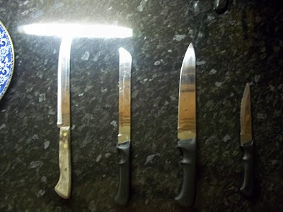
- props can also be effective such as the use of mirrors or weapons, although not really a prop, stairs can also be really effective as they create a chase that is nerve-racking
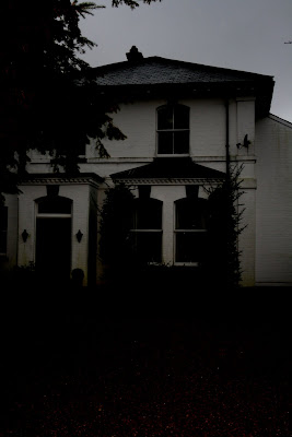
- Setting- This is a very wide category as a thriller can take place pretty much anywhere but the most common settings are woods, houses and holiday homes.


Throughout the project we as a group paid attention to the fact that that we needed to follow the conventions of our genre. We followed the conventional story line using Longacre's theory by beginnining with a 'once upon a time opening' then a 'climax' but also adapted it, as are production is only a trailer we didnt finish with the conventional 'conclusion' as that would defeat the object of it being a trailer. We decided to follow this narrative as we felt it conformed to other real media products. It is a very common theory used in our genre trailer. For example 'The shining' begins with a family going to stay in a hotel. The beginning of the trailer is very calm and happy this creates an atmosphere to the viewers making the almost unaware of the happenings that are about to take place. This also helps build up the tension and suspence and this is exactly what we wanted to do in our trailer. The trailer then takes a turn and the husband becomes violent, there are alot of chase scenes which is really nerve-racking to watch and we have also used an idea like this in our trailer. The trailer then ends on a cliff-hanger almost a "what happens next" and again our trailer does this so that is doesnt reveal what the story line is.
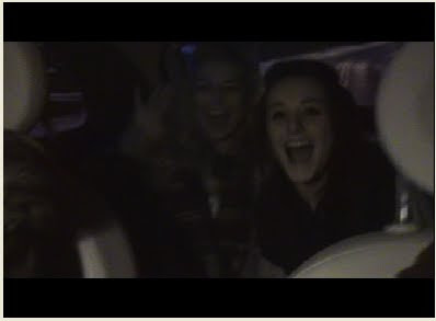
We used similair settings to other films we had looked at for example- Paranormal activity- is set in a normal house, for our trailer we used one of our homes to make it as normal as possible. Another main theme in paranormal activity is the found footage throughout, we also used the idea of a found footage but decided to only use that for a section of our trailer not all of it. Our idea behind this was that it gave it a realistic feel. The fact that the girls were filming themselves would make the viewers feel more involved in the 'excitment' of the girls holiday.
The images below show paranormal activity found footage (op) and our found footage (below) 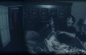
Another way we used and developed the standard conventions of a real media product was attracting are viewers in the same way. In any film these days if an actor in it is highly famous and good-looking it immediatly attracts more viewers. For example the film Jennifer's Body 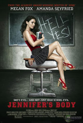
This film made a huge $2.8 million on its first day and most of this money was proberbly drawn in because Megan Fox was playing the main part. We needed to attract are viewers with an attractive girl that could be a 'star' we chose Ellie as she has the typical look of an actress. It was important that ellie was our main picture on the magazine front cover and film poster as these were are main advertisement for the trailer and film. We also devloped this idea, by editing the images of Ellie before they were placed on the magazine front cover and poster. We did this to make them more dramtic and eye catching to the audience. On the magazine front cover we decided to make the image of Ellie red, although this is not a common convention this is an idea has been seen before in films such as 'Red Riding Hood', 'Red white and blue' and 'Dead end'.
Another important aspect of making a realistic trailer and other products was that we followed the conventions of how much information they should hold and how much they should tell the reader. We looked at lots of trailers to see what sort of information they hold about the film. We found that generally it was the Logo- for the production label, the Title, the Release date and maybe a web address. We used all of these in our trailer but also developed them by adding in snippets of writing and the tagline.
For our film poster we followed the conventions of a Teaser poster which almost has set guidelines for what information it holds. We followed these guidelines but also added and took away text where we felt appropriate. To make our poster look as realistic as possible we again did more research into what the conventional film poster looked like. This helped follow but also develop these original ideas. For the magazine front cover we wanted to make it look busy and exciting. We realised that a magazine was much more interesting and appealing when it looked busy but we had to make sure it didn't look to cluttered as it could become confusing. We followed the conventional layout, with this title at the top we also stuck to a colour scheme so that the magazine didn't look tacky.Overall I think we managed to develop and challenge media conventions successfully. Although there are some areas we could of taken the research and ideas further I think what we did do has made our media products look more realistic to the target audience.
No comments:
Post a Comment