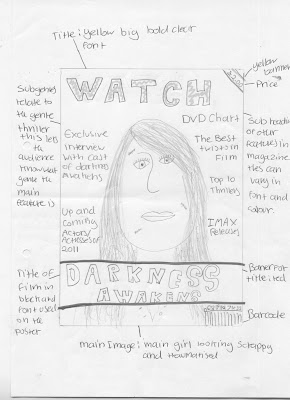
I have annotated around each of the designs to show what each part is.
It is important to ensure that each magazine included a:
- Main title- masthead
- Main image
- Bar-code
- Pictures of other films
Film Magazine Idea One:

 These were just my two initial ideas, After deciding the name of our film I thought I would do one more design with the new Film Title. The other members of my group also did another design so again we had a selection.
 These were our three final designs we were then left to choose from:
 <- This is my final design for a magazine front cover. This front cover design is simple. I didn't want to make it to complex as it might look overcrowded and the reader may find it hard to work out.
 I began by naming my magazine. I named it playback. I saw this name on the side of an old video case I had at home and though it would be perfect for the name of my magazine. I wrote the title on in bubble writing i did this to make it stand out. The typography is quite large and the letters are lightly shaded. As my main image takes up the majority of the background this was the next thing I did so that the rest of the features would overlap the picture. The image is of a girl screaming, she has her face turned to the left and her head is tilted down. She has her hands up to her face covering half of her cheek. This image isn't in colour but the colours were dark greys blues and blacks. Her face was shaded in a grey/creamy colour as if to make he look slightly ill. I did this to show her fear she looks ragged and worn. The main story of our movie trailer is one girl survives the "supernatural being" my idea was that this image was of that girl.
In the top right hand corner I have put the bar code for the magazine, this is quite small as to not take to much attention away from the other features.
Underneath that it says "film awards 2010 highlights" This is in a gold colour. I did it in gold as it was about awards and this colour usually is associated with awards. I also did it because it contrasts with the background and although its only a small feature it gives the reader something else to look at if the main article doesn't interest them.
Underneath that it says "film awards 2010 highlights" This is in a gold colour. I did it in gold as it was about awards and this colour usually is associated with awards. I also did it because it contrasts with the background and although its only a small feature it gives the reader something else to look at if the main article doesn't interest them.
The title of the film "Darkness Awakens" is placed on the right hand side below the main image. This writing is creepy and distorted. This is to hint at the films genre. If the film was a "chick flick" it would most likely have swirly pretty writing. Instead this writing is jaggedy and and scary looking. Ellie Failes is one of the actors we are considering to be the main actor in our trailer. So on the front cover in a circle i have written EXCLUSIVE INTWERIEW WITH ELLIE FAILES this is to premote the film. Her name "ellie failes" is in bold writing to premote her charecter.
 <-Ellas final design for our magazine front cover.
We have decided as a group to use my magazine front cover idea. We liked this idea because it was simple but effective. The back- ground image is eye-catching and will attract the readers attention. The only issue we had with this magazine front cover is that the title of the magazine does not follow the conventions of normal magazines. Most magazines have the title at the top. We decided that when we come to create the actual magazine we will move the title to the top. This wont make much of a difference to the magazine look but it will make the magazine cover more life like.

No comments:
Post a Comment