Thursday, 3 February 2011

Font Changes

As we had decided on fonts on a Non- School computer some of the fonts we picked were unavailable for us to use. Also when using some of the fonts we had picked we decided they just didnt look right or fit in with the theme.

These are the new fonts we will be using, some have remained the same but some have changed.


  • Playback- Magazine front cover name will be in font - Franchise.
  • Darkness Awakens- Title of the film on the magazine front cover, film poster and movie trailer will be in font- ACID LABEL of Dafont.
  • Film awards 2010 highlights- writing on magazine front cover will be in font- impact
  • Exclusive interview- writing on magazine front cover will be in font- Copper STD
  • Issue 217-writing on magazine front cover will be in font-200 Century gothic
  • Trailer writing (Eleanor Failes/ release date)- will be in font Tosca Zero
  • Behind the scenes- magazine front cover- impact

Editing images for the film poster

The editing of the magazine front cover was Ellas job. Image for the Film Poster: We chose this image due to the lighting and the composition of the image. We also felt her facial expression was good. The ratio of her face and hair was effective as her hair was slightly covering her eye giving it a mysterious look. We dressed her in the same clothes as in the trailer to make the connection. Her bright blonde hair gives her a celebrity look making her attractive to onlookers. To edit this picture we used paint, painshop pro, fireworks and in design. Ella first had to remove the background so we had purely just an image of Ellie. We were editing our pictures in paint and Fireworks we used a combination of the Magic Wand Tool and a simple eraser tool. After editing out the background. We played around with the saturation/ hue and contrast to just see what sort of effects we could produce. After discussion and looking at different posters we decided that this image could look quite effective in red. This is the poster that we got the idea from: The red in this poster gives it a real sinister look and I feel this is very effective. The first connection people will make with this colour is blood but also danger. As this image of ellie will be placed in front of the house. The red will make the connection with the house and symbolise that the house could be dangerous.As we were also trying to make our poster as realistic as possible we had to follow the same conventions as an actual film poster. Doing some research we realised having a red picture was quite common in thriller/horror films so we felt it would be appropriate.

Ella went on to change the image into red to see the effect. On fireworks she added an inner glow to the original cut out image and then changed the colour to red. She then made the contrast high and lowered the brightness. We did a few different shades of red to see the difference and decide which one we would like.


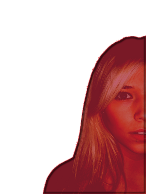
We decided to use the darker red as it represents blood red which fits in well with our genre.

The next stage of the magazine front cover was to edit the background image, I did this by changing the contrast and brightness to make the house look more dramatic. This is the image we are going to use.

After this the next job for ella was to layer the image of Ellie on top of the image of the house to create the final whole image that would be used for our magazine front cover. Ella did this by copy and pasting the picture on top of the house and making it a separate layer. She then moved the image around until she felt it looked right. This is the final image.

The next stage was adding the text. We had decided as a group to use the same throughout for the title this was called Acid Label. We had originally decided the font would be black but Ella realised that it wouldn't work as we were having a black background so instead we made the text white. We felt this worked well as it stood out. Ella also layered this text over Ellie's face to link it all together.

Ella then put the 'stars' names at the top of the poster. We decided with ella that the surnames would look good in red as this would match in with the red picture of ellie. Ella also decided that the surnames would look better in a larger font that the first names. It took a while to pick the font for the names as we wanted one that would look similar to the title the font used for the surname was TOSCA ZERO, a font we have used in the film trailer and the top font is tohoma bold.
As seen conventionally on most film posters Ella added credits at the bottom and our production label:
After this our film poster had finally come together.
This was our final film poster:

Tuesday, 1 February 2011

Images for our film poster

I was in charge of taking the photos and then me and ella edited them so that they could be placed straight onto the poster that is being done by Ella and the magazine done by Charlotte.
Editing:
The first process of editing our images was picking the images we were going to use.
The editing process was Ellas designated job but we all took turns in using the software as it was important that we all became familiar with it.
For the film poster we picked this photo:
We picked this image because it included all the aspects we wanted. We wanted a picture of the house from a front on view, it always makes it dramatic when the house it partly covered as if it is hiding away and the tree is covering a bit of the house which gives it that effect. The composition of the picture is perfect as in on the poster front cover we needed block colours so that we would be able to successfully place writing over the top. The gravel in the drive way will allow us to do this as this is about 35% of the picture.


Monday, 31 January 2011

Film Poster Planning

Ella did a rough template of what our poster may look like as we didnt have any of the actual pictures to put on it so we wanted to do a plan.
Ella did this on Adobe design and we used the original ideas on the original drawn poster.
This is Ellas template


Although this is jsut a rough template it gave us an idea of what our poster may look like. Obviously we wont be using those fonts but it was intresting to see an outline. That we can then change around once the pictures are inserted.

Sunday, 30 January 2011

Editing the images for our magazine front cover

After i took these images I uploaded them to my computer and went onto edit them.


To edit them I changed the contrast brightness and colour tones. This made them really dramatic and gave us a block of black at the bottom so that are text could be inserted. I will now pass these images onto Charlotte so that she can create the magazine front cover.


These are the edited images.


We have decided to use the bottom Left image, we decided on this image as we believe that it is the most effective. It is effective because of the lighting on her face the shadows and the colours. To get Ellie to look scared in the image was quite challenging because they needed to be realistic. But i think this is the most realistic and she genuinely looks frightened. This image is supposed to replicate final scene of Ellie running through the woods away from the camera and I feel this image is most successful.

Saturday, 29 January 2011

Images for Magazine front cover

I was in charge of taking the photos and part of the editing process so that they could be placed straight onto the poster that is being done by ella and the magazine done by Charlotte. I had to replicate the images that we had drawn on the magazine front cover and film poster drafts.
This was the Magazine front cover that we designed, these are the images that I took.
I organised to meet up with ellie (Our main character) to take some photos. It was actually really difficult to re-inact the look we wanted as the way her hair is in the film poster meant it had to be held up to have that effect. After a few shots we managed to have a few potential pictures.


These are a few of the shots:
I ended up having to take this image with Ellie lying on the floor, it is the only was I could successfully get her hair to fan out around her. When doing this I had to ensure I was at the right camera angle so that it didn't look like I was looking down on her. I asked Ellie to look scared and clasp her face and then took as many images as I could.
After taking this image and showing the girls, we realised that it wasn't going to work on our front cover. One reason it wouldn't work is because it is a landscape photo meaning that it would have to be stretched to fit the the poster how we would like it.
I will reschedule with ellie to re-take this image.


I arranged to see Ellie to take the image for the magazine front cover again.
This time I did it with dramatic lighting to give it a spooky effect.I think these worked well, It was hard to be able to organise the image as I was trying to put the light in a dramatic way and take the image at the same time.

Friday, 28 January 2011

Texts for film trailer

We had said in earlier planning that we would use Castellar bold for the font in the Film trailer. When actually doing the trailer we realised that isnt the font that we wanted to use. So we as a group went looking on http://www.dafont.com/ for another font.
We came across many fonts that we then tried out in the trailer but they didnt look right, we thought we wanted a bold straight lined font that really stood out, but after a while we realised that this wasnt the case. We needed a font that was similar to the film title as this was going to stay the same as before. We then came across a font called TOSCA ZERO. We felt this was really good as it was similar to the title font which showed a link.

This is the font below: