The editing of the magazine front cover was Ellas job. Image for the Film Poster:

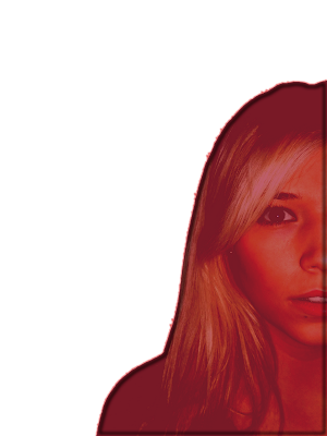
We chose this image due to the lighting and the composition of the image. We also felt her facial expression was good. The ratio of her face and hair was effective as her hair was slightly covering her eye giving it a mysterious look. We dressed her in the same clothes as in the trailer to make the connection. Her bright blonde hair gives her a celebrity look making her attractive to onlookers. To edit this picture we used paint, painshop pro, fireworks and in design. Ella first had to remove the background so we had purely just an image of Ellie.

We were editing our pictures in paint and Fireworks we used a combination of the Magic Wand Tool and a simple eraser tool. After editing out the background. We played around with the saturation/ hue and contrast to just see what sort of effects we could produce. After discussion and looking at different posters we decided that this image could look quite effective in red. This is the poster that we got the idea from: The red in this poster gives it a real sinister look and I feel this is very effective. The first connection people will make with this colour is blood but also danger. As this image of ellie will be placed in front of the house. The red will make the connection with the house and symbolise that the house could be dangerous.As we were also trying to make our poster as realistic as possible we had to follow the same conventions as an actual film poster. Doing some research we realised having a red picture was quite common in thriller/horror films so we felt it would be appropriate.
 Ella went on to change the image into red to see the effect. On fireworks she added an inner glow to the original cut out image and then changed the colour to red. She then made the contrast high and lowered the brightness. We did a few different shades of red to see the difference and decide which one we would like.

We decided to use the darker red as it represents blood red which fits in well with our genre.
The next stage of the magazine front cover was to edit the background image, I did this by changing the contrast and brightness to make the house look more dramatic. This is the image we are going to use. 
After this the next job for ella was to layer the image of Ellie on top of the image of the house to create the final whole image that would be used for our magazine front cover. Ella did this by copy and pasting the picture on top of the house and making it a separate layer. She then moved the image around until she felt it looked right. This is the final image.
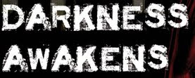
 The next stage was adding the text. We had decided as a group to use the same throughout for the title this was called Acid Label. We had originally decided the font would be black but Ella realised that it wouldn't work as we were having a black background so instead we made the text white.
  We felt this worked well as it stood out. Ella also layered this text over Ellie's face to link it all together.
Ella then put the 'stars' names at the top of the poster. We decided with ella that the surnames would look good in red as this would match in with the red picture of ellie. Ella also decided that the surnames would look better in a larger font that the first names. It took a while to pick the font for the names as we wanted one that would look similar to the title the font used for the surname was TOSCA ZERO, a font we have used in the film trailer and the top font is tohoma bold.

As seen conventionally on most film posters Ella added credits at the bottom and our production label:

After this our film poster had finally come together.
This was our final film poster:


 We were editing our pictures in paint and Fireworks we used a combination of the Magic Wand Tool and a simple eraser tool. After editing out the background. We played around with the saturation/ hue and contrast to just see what sort of effects we could produce. After discussion and looking at different posters we decided that this image could look quite effective in red. This is the poster that we got the idea from: The red in this poster gives it a real sinister look and I feel this is very effective. The first connection people will make with this colour is blood but also danger. As this image of ellie will be placed in front of the house. The red will make the connection with the house and symbolise that the house could be dangerous.As we were also trying to make our poster as realistic as possible we had to follow the same conventions as an actual film poster. Doing some research we realised having a red picture was quite common in thriller/horror films so we felt it would be appropriate.
 Ella went on to change the image into red to see the effect. On fireworks she added an inner glow to the original cut out image and then changed the colour to red. She then made the contrast high and lowered the brightness. We did a few different shades of red to see the difference and decide which one we would like.


